At Kitestring, we help socially-conscious businesses and organizations connect with their communities through purpose-driven design and down-to-earth marketing solutions.
Honestly, we appreciate good design for any purpose. But our true passion lies with design for social impact.
What is design for social impact?
We think of designing for social impact as any marketing campaign or graphic design that has a purposeful message with the goal of making a tangible difference in the world, that also considers its ethical implications.
Whether it’s a design for social good that promotes environmental sustainability, raises awareness of social service gaps, or builds up a community – it has to make a difference.
As a design and marketing agency, we know good design can make a cause stand out, connect with people, and reach its goals!
In a marketing world that’s busier and more competitive than ever, it’s important that socially responsible campaigns hold their own. That means being compelling, entertaining, awe-inspiring, and action-driven.
We’ve gathered together some of our favourite designs for social good – some we helped to bring into the world, and others from other design agencies we admire.
1. Building Community with Jackson Square
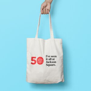
Downtown Hamilton is facing a homelessness and gentrification crisis, similar to most communities across the country. Jackson Square lives at the heart of Hamilton’s downtown core, and offers a variety of services to our community.
As Jackson Square approached its 50th anniversary, their team was looking for a way to rally the city and say thank you for 50 memorable years. Based on Kitestring’s conversations with community stakeholders, we came to recognize the importance of reflecting the true nature of Jackson Square – the challenges, the small joys, and more!
The We’ve Seen It All at Jackson Square campaign started a conversation between Hamiltonians. Community is sometimes messy and hard. But there’s always moments of humour, beauty, and belonging when you look for them.
2. Keeping Periods Real with Hey Girls
This campaign from GoodAgency spoke to their clients’ social good mission (as their sanitary products are buy one, give one), while delivering a simple design that made the viewer stop to think.
One day millions of people opened newspapers and magazines to see an outline of a sanitary pad – giving people a reality check that many girls and women around the world don’t have access to the menstrual products they need.
We love a message that is delivered powerfully via a compelling, connected medium.
3. Know Your Lemons with Worldwide Breast Cancer
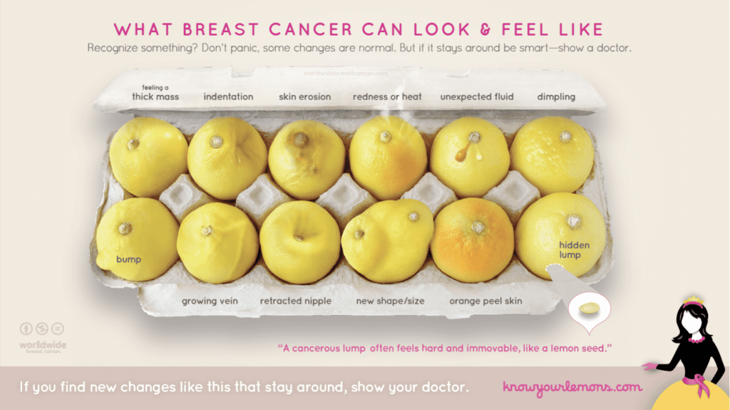
Corrine Ellsworth Beaumont is a graphic designer whose grandmother died due to breast cancer. Corrine could not find useful resources to help self-identify the signs of breast cancer. As a graphic designer, she created a series of graphics that went viral back in 2017.
The Know Your Lemons campaign is still online today – because it has staying power. It’s simple, hyper visual, and super impactful.
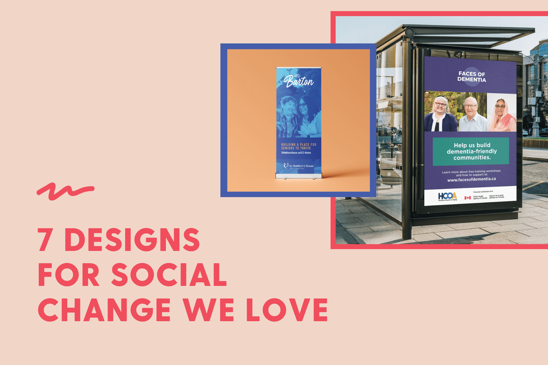
4. Faces of Dementia Campaign with Hamilton Council on Aging
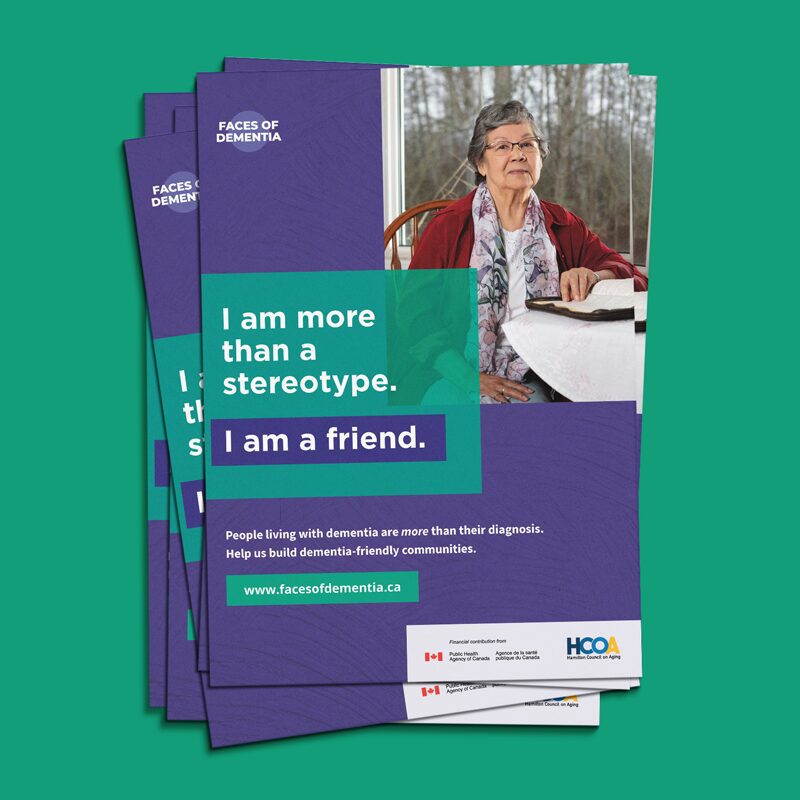
Another one of our incredible clients, Hamilton Council of Aging, wanted to challenge the stigma surrounding dementia. There was a lack of understanding about what dementia was and who it affected.
The Faces of Dementia campaign, brought to the centre people from the dementia-friendly community, as well as people living with dementia and their care partners. The campaign was designed to tell diverse stories and focused on breaking down stereotypes and showcasing each individual’s other identities.
Now, the Faces of Dementia Campaign is traveling across the country (and beyond), challenging stereotypes of dementia and building knowledge to create dementia-friendly communities.
5. Danger in the Water with Less Plastic
Design agency Partners + Napier, used found objects to create a series of visuals for the non-profit Less Plastic to highlight the biggest threat facing our oceans: plastic.
Another example of the medium becoming a part of the message – we love that they used discarded, one-time-use plastic to create the graphics for their campaign.
6. Gratitude with United Way of St. Joseph’s County
Social proof, testimonials, and reviews are a huge part of building trust with your community.
So, we love this sweet campaign from United Way of St. Joseph County. It feels like a real thank you from real people.
7. 412 Barton: A Place to Thrive with St. Matthew’s House

The crisis in affordable housing across Canada, is also affecting our local Hamilton neighbours. St. Matthew’s House has created an affordable housing project being built at 412 Barton.
This is a little different from the other examples we’ve shared, as this was the creation of the 412 Barton brand. This is a dignity-driven brand, inspired by hotels and vintage apartment buildings.
The tagline “A place to thrive” was crafted to convey a sense of celebration and community, emphasizing that 412 Barton isn’t just a place to survive, but a place to find community, safety, and joy.
Are you part of an organization that is trying to create social impact or social change? Are you in need of support to get your message to your community in a way that stands out? We’re your partners in creativity. Let’s create social impact together.

