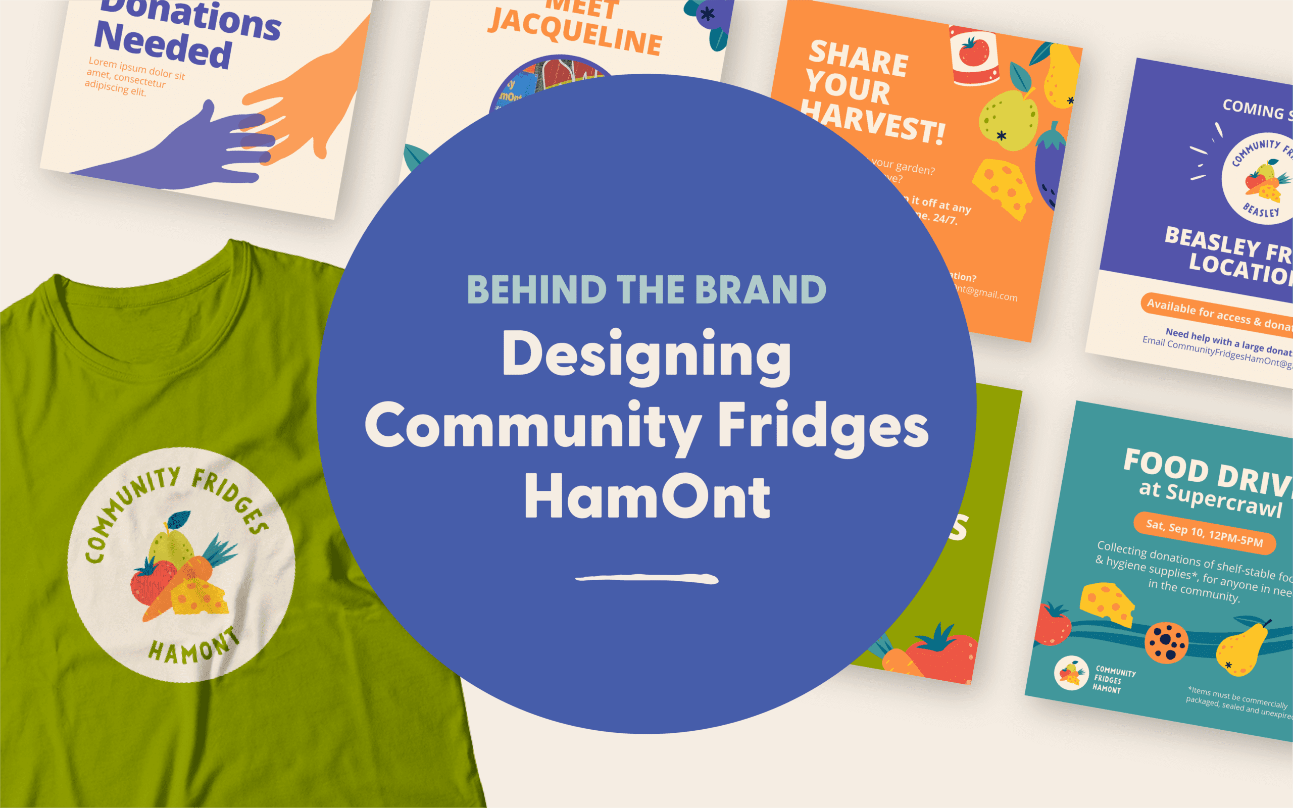
Since joining the Kitestring team in early 2021, I’ve worked on many design projects. Each project that comes our way tells a different story and uniquely engages us, but there is one branding project that really stands out to me: our brand design for Community Fridges HamOnt (CFH).
We approached CFH about rebranding as a fun, but a much-needed opportunity to build awareness and highlight CFH’s impact on their community. They were just as excited about it as we were! Let’s take a peek at who CFH is, and the impact they are making.
Community Fridges HamOnt is a volunteer-run mutual aid group in Hamilton, Ontario that provides support and community care through access to food and vital supplies.
Community Fridges HamOnt is passionate about combating food insecurity and that passion is what sparked our interest in building a brand just as compelling and colourful as their team. They needed a brand that would speak to the community and showcase their work as an essential initiative in the food security landscape in Hamilton.
The scope of the project included a full brand package, with a small brand guide and collateral pieces, such as social media posts and brochures. This is the second brand project that I took the lead on at Kitestring, which made it even more exciting!
We started this pro-bono project with an in-depth look at other community fridges and their branding to give us a clearer understanding of what does and doesn’t work in this space.
Then we got to work! Marin and I dove into Community Fridges HamOnt’s goals, challenges and potential messaging. We wanted to ensure that they would have everything they needed in this branding project moving forward in order to make sure they were successful. We mapped out their wants and needs, the tone we wanted to convey and our rough ideas for what we wanted to include in their logo. Now with all of this in place, we started on the design.
Looking at a blank page with an entire brand ahead of you can be daunting, but I like to break things up and focus on the smaller tasks to get things started. This can include sketching out rough ideas, looking up inspiration, or moving shapes around on Adobe Illustrator to see if I can come up with any cool ideas. It’s also nice to put on a fun playlist or podcast while working to really get in the zone!
With our research and brand attributes in place, my first job was figuring out the structure of the logo and graphics that might build a connection with the CFH audience. I explored fonts, colours, and illustration styles that would speak well to the personality and tone of the CFH initiative.
At some point I tend to plateau or work backwards, realizing that I’m overcomplicating things, or feeling unsure about what direction to take next. Sometimes going back a few steps to re-evaluate my process can help get me out of a design funk and highlight the strongest direction. That’s exactly what happened with this design.
I knew my first batch of logos wasn’t the final product, but once I’d started the ideas kept flowing until I slowly started seeing everything come together, which is definitely worth it!
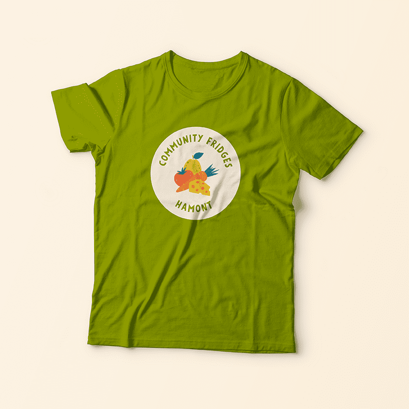
One of my favourite parts of the process is when things are finally starting to come together, and we’re in the refining phase. It’s always satisfying seeing the initial logo versus the we’re-almost-there logo.
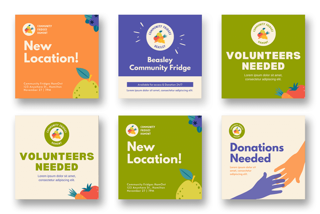
With the logo refined and ready to go, we get started on the brand graphics and collateral pieces. This is where we really get to see the brand come to life and it’s my second favourite part of the design process. The colourful, fruity pattern pairs really well together with the icons and secondary logos, and the font and colours reflect the vibrancy and community-driven nature of CFH. The fruits and veggie graphics are endlessly fun and really make the brand stand out!
I think this brand identity has truly aided in bringing forward the professionalism of Community Fridges HamOnt and can help to build a stronger connection with the community, potential donors and community members who access the fridges.
For a more in-depth look, you can view the brand case study here. To learn more about Community Fridges HamOnt, follow them on Instagram and be sure to check out their new website (coming soon).

